
Europe - Climate graphs
Climate
978-3-14-100890-6 | Page 52 | Ill. 3
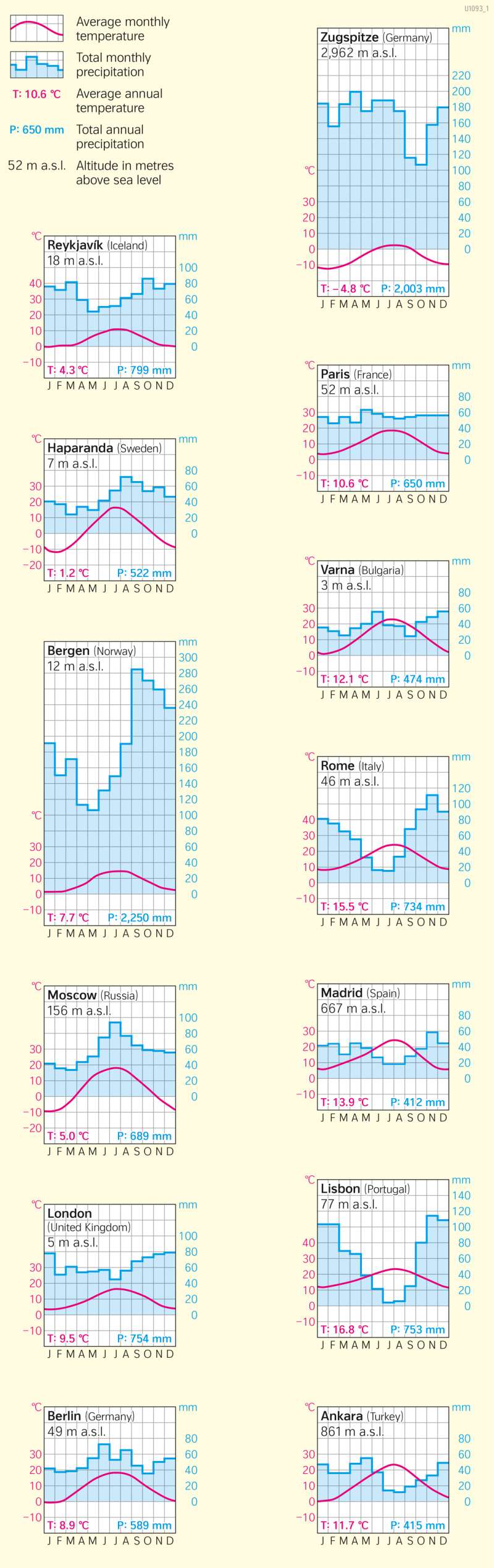
Overview
Climate diagrams are best suited for an apparent direct comparison of climatic conditions of different geographical regions.They consist of three axes. The horizontal axis shows the individual months of the year. The left vertical axis shows the temperature in degrees Celsius, and the right vertical axis shows the precipitation in millimetres. One millimetre of precipitation corresponds to one litre of precipitation water per square metre. As additional information, the diagrams also show the annual average temperatures, the average annual totals of precipitation and the height above sea level of the respective station.
How to interpret climate diagramms?
The temperature and precipitation values on the two vertical axes are compared with each other in a ratio of 1:2. Thus, 10 degrees Celsius on the temperature axis corresponds to 20 millimetres on the precipitation axis, 20 degrees Celsius corresponds to 40 millimetres, and so on. This makes it possible to estimate, if necessary, whether humid or arid climatic conditions prevail in a month:
- The precipitation column is higher than the temperature curve: month with humid climate. Potential evaporation is lower than precipitation (N > pLV).
- The precipitation column reaches or is above the temperature curve: Month with arid climate. Potential evaporation is greater than precipitation (N < pLV).
The selection of climate diagrams shown comprises the most important climates on the maps on pages 52 and 53. The respective stations are marked on the maps for localisation.